No matter what your opinion is of The Economist, their use of graphics and maps helps shed light on complex policy issues – and often those with a regional dimension. For example, in 2010 they published a fascinating map on the ‘true size’ of Africa (below), following the earlier example by Kai Krause.
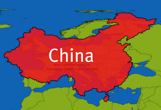
This is actually something we’ve covered on this blog before, when we compared the United States to China in preparation for our Beijing 2012 International Conference. This helps us re-think what a ‘region’ might be and, for those of us in Europe, it usually makes us feel quite small.
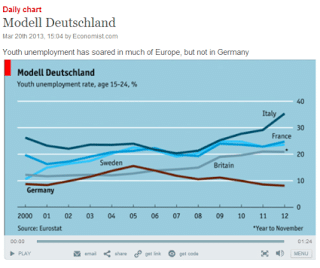
The basic point here is that graphics and maps can be really powerful tools to explain quite complex situations and this is something that The Economist’s Graphic detail blog does really well. It provides a regularly updated digest of charts, maps and infographics which also feature in the print edition. It also provides videos on key issues, such as on unemployment across Europe – and the story of ‘Modell Deutschland’ below.


